As marketers, we do our best to stay on top of best practices. But the reality is that trends are changing all the time. How people interact with your website may vary from month to month.
That’s why a one-size-fits-all content solution never works.
Five years ago, your website could rank for the number one spot in Google if it wasn’t responsive on a mobile device. Now, you’d be hard-pressed to find a website that hasn’t been optimized for mobile in the top 5 search results.
Buying habits change. Websites change. And sometimes, your product or service changes.
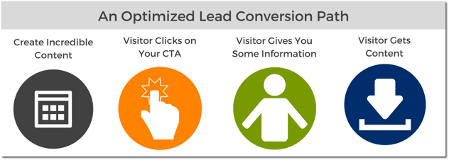
So, what is the best way to convert website visitors into leads? The answer is simple: Create a conversion path that is clear and easy to follow, and test everything.
Here is where an optimized CTA fits into your lead conversion path:

In this article, we explore three simple best practices for A/B testing HubSpot CTAs to increase click-through rate, with examples that you can steal for your own marketing.
But, first things first: What does it mean to A/B test a CTA?
You have an incredible piece of content you want to share with the world to capture new leads, or to move leads further down your funnel. Examples of content you may link to a Call-to-Action are:
- Blog posts
- White papers, eBooks, product guides, or how-to guides
- Contact us page
- Request a demo page
In HubSpot, you're able to track the ratio between the number of people who have viewed your CTA during their website travels, and the amount of people that have clicked on it.
While the percentage ratio can vary from industry to industry, a helpful and optimized CTA should generate approximately a 2% click-through rate. That means, for every 100 people that visit your website page, at least two of those visitors should click on your CTA.
If your CTA is underperforming, especially as it relates to other CTAs on your website, you may consider slightly altering the CTA in what is known as an A/B Test.
A/B Testing a CTA means that you create a clone of your CTA, and change a singular element of the CTA, such as the color of the button, or the language used, and publish both CTAs together. Then, half of your visitors will see one variation, Variation A, and the other half of visitors will receive the second variation, Variation B.
This allows you to compare how your website visitors engage with the CTA based on your changes. After the CTA variations are live for a significant amount of time, you can permanently change the CTA to the successful variation with the click of a button, or use the successful variation in yet another A/B test.
Note: It’s a good idea to leave your CTA A/B test running for at least one month before examining your HubSpot CTA analytics and deciding on a “winner”.
Let's take a look at three easy variations you can A/B test today:
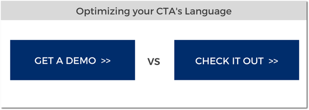
#1. The Language Used
If you’re not generating enough visits to your content from your CTA, you may consider testing the language used on your CTA button.
Best Practices for CTA Language:
- Keep it short: 1-3 words is ideal. Use more than 5 words on a CTA and you could lose visitor interest, especially those who are visiting on a mobile device.
- Use actionable language: You can guide people through your website by using actionable verbs in your CTA that emphasize a benefit for the recipient. Examples would be: download, view, get, review, etc.
PRO TIP: When testing language, it’s important that all of the other CTA elements remain the same. For example, the shape, color, font size, and images used with the CTA should be unchanged. This will allow you to test what language speaks best to your audience.

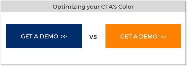
#2. The Color Used
One of the most common ways to A/B test a CTA is to change the background color. Simply changing the color of your CTA to a contrasting color so that it stands out on the page can drastically increase click-through rate.
Best Practices for CTA color:
- Use a contrasting color within your brand guide to help make your CTA “pop” on the page.
- Try to avoid using yellow-blue and green-red color combinations, as these are most difficult for the human eye to process together.
PRO TIP: You can complete this CTA test after you've determined the language that is most successful above. For example, if you determine that “Get a demo” is the most impactful language, you could complete a secondary A/B test to see what color works best with your audience. This way, your CTA is constantly working to be the best it can be!

#3. Plain vs Iconography:
Another variation you can A/B Test is the addition of an image or iconography to your CTA. Since images are processed faster than text, something as simple as adding a small icon can help to increase click-through rate.
Best Practices for Adding Iconography:
- You can use a free website like Canva.com to access hundreds of free icons
- HubSpot Marketing Library also has free resources for customers to use
- Keep it simple – you want the focus to be on the benefit for your visitor
PRO TIP: When adding an icon to your CTA, you will have to create a custom image outside of HubSpot’s software. Then, once you’ve saved your CTA button as a png or jpeg file, you can upload it as an Image CTA to HubSpot.

A/B testing is just one of the may ways you can power up your B2B website. If you're looking for more helpful information on improving your Calls-to-Action, check out these helpful posts:
- How to Improve Your Click-Through Rate with Better CTA Design
- Why We Love HubSpot Analytics (Part 3): HubSpot CTA Analytics
And for additional information on how to turn visitors into valuable leads, check out our free comprehensive guide: 8 Ways to Power Up Your B2B Technology Website.


