Are your CTAs performing as well as you would like them to be? Are they assisting your lead and customer conversion efforts, or are they just harming them? Despite that a CTA is one of the simplest components of any complete inbound marketing strategy, it has one of the most important jobs!
But before we dive in, let’s backtrack a little bit… What exactly is a CTA?
A CTA (or Call-to-Action) is an image or line of text that prompts your visitors, leads, and customers to take a specific desired action. In the B2B lead generation process, a Call-to-Action grabs the attention of your website visitor and redirects him to a landing page on which this visitor could possibly convert into a lead.
Now, where do you place CTAs? Literally just about anywhere! CTAs can be included on your home page, in emails, at the bottom of blog posts, on product pages, press releases, social media profiles, etc. Consult your data analytics and check out which of your site pages are garnering the most visits (and providing you with the most conversion opportunities), and prioritize placing CTAs at these points of friction.
It’s also important to note that CTAs are most effective when they resemble buttons. How that graphic looks is completely up to you. The goal? Create better CTAs to achieve better CTRs! Although your options are broad, it turns out that great Calls-to-Action do share some similar qualities worth noting.
Below are 7 CTA design tips you can implement in order to improve your click-through rate — and pump up the potential for converting more leads.
1. Make your point crystal clear.
Avoid vague phrasing that could appear misleading – or that lacks any oomph. Although your CTA shouldn’t be riddled with all kinds of copy, it should provide enough detail to motivate the site visitor and let them know what you’re offering and how they can access it.
2. Design your CTA to look “click-able.”
Again, some form of button design works best. After all, the point is for members of your target audience to click on the CTA. So whether you create a 3-D aesthetic, activate a motion graphic or change in color when a visitor scrolls over the image, or simply shape your CTA in a way that differentiates it from the rest of your content, ensure you are doing something that entices a click!
3. Align your CTA copy with copy on the landing page.
When a person follows your Call-to-Action, they are brought to a landing page that gates the same offer the CTA represented. If the LP’s headline and/or imagery does not match up with that of the correlating CTA, the chance of that visitor bouncing is much higher. A person should immediately know they have arrived in the right place, so keep your copy consistent.
4. Ensure your CTA stands out.
Though your Call-to-Action should adhere to your company’s branding guidelines (website colors, fonts, etc.), be sure that the CTA doesn’t blend right into the background. Place CTAs in an area with white space and make them large, bright and bold. In addition, you do not want these images to look like random paid advertisements – so avoid using very obvious stock photos that could possibly dilute the meaning and value of your offer.
5. Use numbers.
Including a compelling statistic often prompts a higher click-through rate. Depending on the industry you’re in, many people respond to hard facts better than clever copy. Moreover, letting your visitors know a high number of people have already downloaded, purchased, or registered for the offer, product, event, etc. creates a sense of urgency. No one wants to be left out or miss something important! The power of simple numerical evidence should never be underestimated – just make sure you’re being honest, or your company can lose some serious credibility.
6. Include a testimonial.
On a related note to #5, credibility is key. A brief customer quote or a certification badge seamlessly woven into the CTA design provides added authenticity to your offering. Sometimes a built-in referral can make a substantial difference!
7. Create location-specific versions.
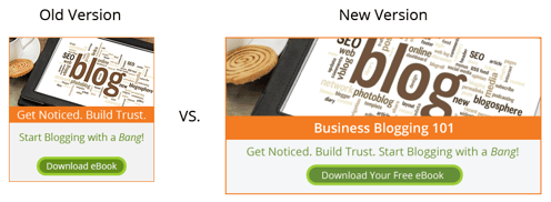
A CTA on your home page should not look exactly like the one in the sidebar of an email or at the bottom of a blog post, even if it’s for the same offer. While squares and circles work best on site pages, we recommend using longer, more rectangular CTAs on your blog. Recently, our team had success improving some of our click-through rates by replacing old CTA buttons with more blog-appropriate Calls-to-Action at the end of our posts. For example, our new CTA for Business Blogging 101 has doubled the CTR of the previous smaller square version. And we expect this gap to increase across all of our CTAs as time goes on. See the difference below (image size has been decreased):

Remember, you should always test the effectiveness of your CTA design. If one approach doesn’t work, try another technique or style, or sub in different text. This way, you are giving your business every opportunity to generate new qualified leads, and you'll find that your click-through rate will be telling a different story than before. Plus, you can check 'setting up Calls-to-Action' off your inbound marketing campaign checklist! If there's anything we can do to assist you, let us know – we're always happy to help.


