 You've just spent hours on creating a new content offer that helps your prospects solve a particular industry-related problem. You also built a landing page on which these prospects can submit some of their contact information in exchange for that offer. Now what?
It's time to design your Call-to-Action! The CTA is the image you place throughout your website that will lead traffic to that particular landing page... and help generate leads!
Of course, your CTA design should be enticing, aesthetically appealing and thoughtful in order to inspire the user to engage and take action. Honestly, it doesn’t matter how educational and valuable your offer is if no one ever clicks on the CTA and misses the opportunity to read it. Designing a CTA and slapping a button anywhere on your website isn't going to drive conversions. Below we'll explore what makes for a winning CTA design that facilitates greater click-through rates.
The Sizing:
A CTA that isn't sized correctly can drastically affect its performance by making it look cheap and out of place. There should be enough space around your Call-to-Action so that it flows naturally with the rest of the content on the page. You don't want your image to butt up against text, yet you certainly shouldn't place it so far way that there is too much dead white space in the middle of your copy. (Here's a nice post by Unbounce that talks about choosing the best postions for your CTA.)
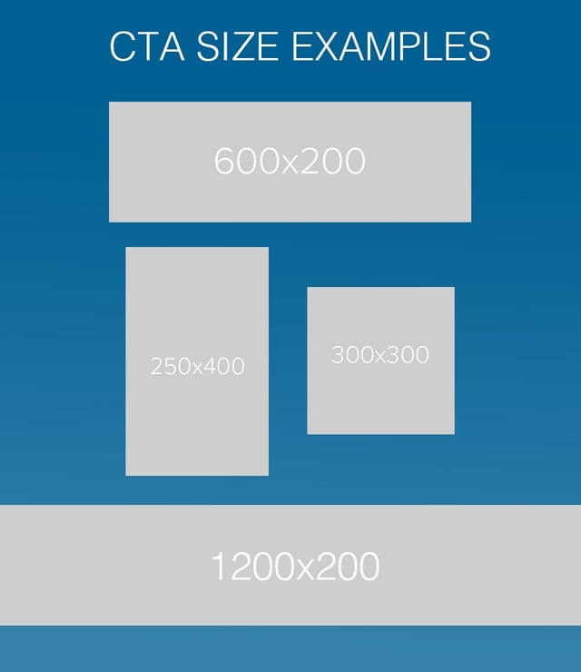
Below are some standard sizes to help you get started on your CTA design.
- Inline CTAs for blog posts and email: 600 x 200 pixels
- These dimensions provide you with a little open space on the sides when viewed on desktop, but they tighten up nicely on mobile devices. 200 pixels is a fairly large depth that gives you ample room to work when designing. If you'd like something thinner or longer, you can adjust the sizes accordingly from there. And remember, the first number is the pixel width and the second number is the pixel height.
- Side bar: 250 x 400 pixels
- Square: 300 x 300 pixels
- Full-width web page CTA design: 1,200 x 200 pixels
- This would be a module or custom HTML to be built onto your page.

Imagery in CTA Design:
The imagery should inspire and compel the user to taking action. It should also match the same design aesthetic and imagery of the landing page to which it is linking. If one image is designed into your CTA and then the landing page hosts another image with an entirely different feel, there will be a disconnect for the user and it will likely negatively impact conversions.
When incorporating images, photography, etc. into your Calls-to-Action, it's important to choose visuals that will work for varying sizing. Moreover, an image that will work for horizontal CTAs isn't always going to be the best fit for a vertical CTA. I look for images that have a lot of open space around the focal point. That way when you have to adjust the image to fit varying sizes, you lose some of the open space but maintain the important part of image.
When choosing an image for your CTA design, you should keep the following attributes in mind:
- Image quality – Make sure it's large enough to be transformed to fit your CTA. If it's too small and then stretched, you will lose pixel quality. If you're downloading from an iStock type site, do not choose the smallest size.
- Authenticity – Find an image that doesn't look too "Stock"... you might turn off prospects by looking just like everyone else, or giving off an untrustworthy vibe. Try thinking in terms of metaphors and get creative with your selections.
- Message – Your images shouldn't just be pretty. You want them to reinforce what the CTA stands for!
And for CTA button designs?
- Color – Your selection should be loud enough to be heard, but not screaming at the user. Just be sure to utilize colors that stand out against your background. If there isn't enough of a contrast, the action you want your visitor to take will be lost.
- Form – Call-to-Action buttons can take many shapes and sizes. Just be sure to facilitate a sense of consistency on your website by using the same shape (circle, oval, rectangle, etc.) for your various CTA buttons. For example, the CTA button at the bottom of this blog post is a rectangle, and therefore, all other blog post CTAs on our website are rectangular, as well.
- Buttons vs. images – Many CTA generator tools offer simple button designs you can plug text into. But don’t use those stock buttons only; it doesn't appear as professional as you might think. Make use of images, icons and illustrations in your CTA designs.
- Text – The button text should have a simple and clear purpose. What do you want them to do? Be specific and be succinct. HubSpot has a great blog post about some people that are doing CTA copy right. Check it out!
All of these considerations combined can help you create better performing CTAs. If you're looking for additional tips, check out another post we published on CTA design here. And always feel free to reach out to us if you want to have a more in-depth discussion about web design!


