Webinars are one of the most effective educational tools for your marketing. You spend weeks, sometimes months, planning the perfect webinar topic. How do you make sure the right audience attends?
Email webinar invitations, alongside a strong social media presence, can help you capture the right audience. But in an era where everyone’s email inbox is bombarded with promotional content, it's critical your invitation stands out from the crowd.
Our marketing team put our heads together to talk about our own webinar invitation strategy, and about webinar invitations that stood out in our own inboxes. Here’s what we've found:
1. Nothing Else in This Post Matters Unless You Have the Right List of Recipients
To email or not to email? That is the question. And it’s a really important one. Just because you got a great deal on that purchased list, doesn’t mean the first thing you throw at your new contacts is a pretty webinar invitation. (Purchasing lists is a post topic for another day.)
If you take away anything from this blog post, let it be this: send your invitation to people who already want to learn about whatever your widget or service is. Whether they downloaded a piece of content on your website, they subscribed to your blog, or they're an existing customer, tailor your invitation to people who want to hear more from you. Your email sender score and click-through-rate will thank you.
First, decide who your target audience is. You’re not just speaking into your laptop’s microphone during the webinar. You’re speaking to potential customers. Ask yourself: who is the perfect customer? Then think about how you can segment your database to send targeted messaging to that audience. Here are a few ways you can segment your database:
- Industry
- Job Title
- Company Size
- Pain Points
- Related content they’ve already downloaded
Once you’ve created a list (or lists) of targeted recipients, tailor the benefits of attending the webinar for that persona. Avoid talking about yourself or your product. Instead, talk about your recipient through personalization. Which brings us to our next point…
2. Personalize Everything
Once you’ve got your segmented recipient list in hand, make sure you’re using an email service provider that allows you to incorporate elements of personalization. You should be pulling in the first name of your recipients whenever it makes sense to do so. But personalization goes beyond just using someone’s name. Start by shifting the focus away from your company or product. Here’s a great example of what not to do:
- Join our webinar to see how our awesome wedding planner makes organizing your wedding details easier!
Yes, your widget is great – but people are going to attend your webinar to see how your product solves their problems. Talk to your audience about the benefits of your product, as if you were explaining them to a close friend:
- Don’t let the stress of planning your big day make your eye start to twitch. Let us show you everything you need to do (and when to do it) for the 12 months leading up to your wedding day.
Much better! Take a gander at this incredible example of personalization in an email from SnapApp:
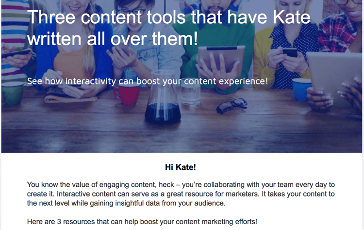
You can bet your bottom dollar that I clicked through to see that content.
3. A Picture’s Worth a Thousand Words (and Clicks)
Webinars are a predominately visual medium. Investing a little time and money in a visually-appealing email is not only a successful click-through strategy, but it gives your recipients a taste of the quality of your webinar. First impressions are important. Use a high-quality image to summarize the details of your webinar in a top-of-the-fold visual block.
Here’s a great example from the app Happify:

The entire image is hyperlinked, so anywhere the user clicks will direct them to the webinar’s registration page.
Here is another great example:

Here are elements you should include in your image banner:
- The primary benefit for the attendee – what will they learn or gain from attending?
- The time and date
- An actionable “button” to click, although it is a best practice to hyperlink the entire image
- Alt text that describes the image in case your banner doesn’t render for the recipient
It’s also not a bad idea to include an image of your speaker, which brings us to our next point…
4. Include Details about Your Speaker in the Email's Body
More and more we are seeing a trend in webinar invitations that include an image and biography information about the speaker. This is a great way to connect instantly with your audience. Positioning your webinar as a learning experience from an expert in your industry creates a positive educational frame for your presentation.
After all, marketing is all about making connections with other people! Attendees want to feel like they are connecting with an expert, not a product or company.
Here is a really great example from Vitae:

If you’re giving the presentation yourself, do not be intimidated. You do not have to be the vice president of your company or have a Ph.D. to outline your own positive experience with the product or service you are selling.
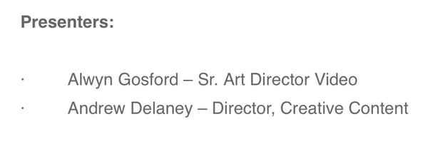
Here's how Getty Images positioned presenters in a recent webinar invitation – short, sweet, and to the point:
5. Prominently Feature the Date and Time of Your Webinar
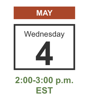
Yes, it seems like a no-brainer. But if you only have a few moments of someone scanning through your email, you want to make sure the date and time stand out. But remember: the most important detail of your webinar is the benefit of attending. So make sure your date does not outshine those key takeaways.
You can use big, bold text to detail the date and time. Or you can get a little more creative, like Vitae did with this calendar detail:
6. Allow Participants to Submit Questions Before the Webinar
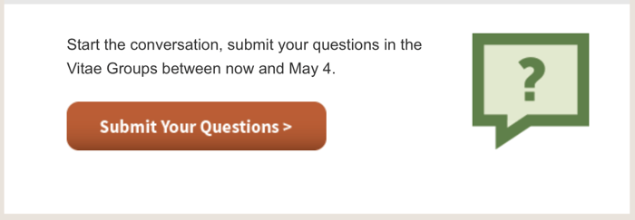
Canvasing your audience before the webinar for questions they’d like answered, or areas they’d like the presenter to focus on is a creative and engaging way to increase webinar attendance. Create a basic landing page where participants can submit questions on a form. This not only helps to further qualify leads and increase attendance, but allows you to tailor the presentation to your audience.
Here’s another example from Vitae:
7. Review and Test and Review Some More
Just like any email send, you should take a few moments to review the data. What elements did people click on most? Were more people viewing your email on mobile than in desktop? Keep a running document of elements that worked well, and incorporate these details in future sends.
For more help with your webinar invitiations, check out our blog post 6 Tips for Writing Open-Worthy Email Marketing Subject Lines. Or reach out to our team to get your email marketing efforts on track! We've helped numerous clients pump up their webinar registration and attendance rates.
